

Role
UX Researcher
Interface Designer
Experience Designer
PROJECT TYPE
Academic
Dates
Aug 2024
(4 weeks)
Tools
Figma
Adobe Creative Suite
Teammates
Calvin Alexan
Yufeng diao
Jacques D.Widodo
Responsibilities
User Research
Usability Testing
Mock-ups
Wireframing
Prototyping
UX/UI
final mock-up

Goodly’s goal is to ensure easy access to essential information about their identity, offerings, products, and store locations for customers.
Research methods


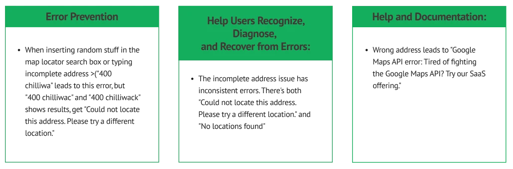
HEURISTIC EVALUATION
We conducted a heuristic evaluation of the Goodly website using Jakob Nielsen's ten usability principles, focusing on system visibility, user control, consistency, and error prevention. Each team member independently rated the interface on a scale from 1 (cosmetic issue) to 4 (critical issue). The evaluation, completed over two sessions by a team of four evaluators, prioritized identifying and addressing critical and major issues to enhance the user experience.
Consistency and Standards
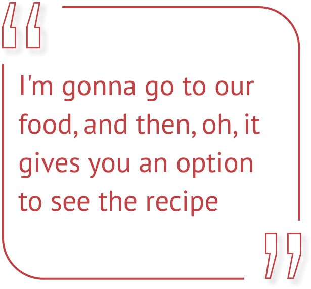
The "Chicken Orzo Soup" page lacks a recipe option, contradicting user expectations. Inconsistent button designs and redundant navigation between the landing and "Our Food" pages create confusion. Renaming the "Where to Buy" button to "Store Location" would also improve clarity.

Visibility of System Status
User Control and Freedom
The "WHERE TO BUY" button changes color on hover, misleading users. Zoom-in animations on "Our Food" page images falsely suggest clickability. The store locator lacks feedback when a store is selected, requiring users to manually check for updates, disrupting navigation and interaction.


First usability Test

A consent form is required to have the participant to join the study and to be informed of the procedures to be done.

Having questionnaire prior to the test provides context regarding the participant’s background.

The participant does tasks on the website to identify if there are any comments or pain points. This is done while the participant “thinks aloud” to share their thoughts while going through the experience.
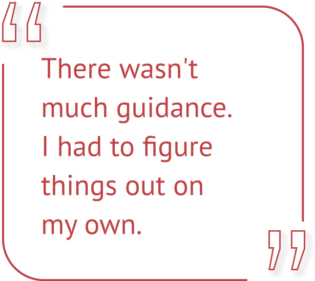
Prior to the main usability study, all team members participated in a pilot study to test the methods and tasks. This allowed us to refine our approach, ensuring the tasks were clear and effective. We removed the task of finding employment information after realizing it was irrelevant to our primary usability evaluation goals.
We conducted an initial usability study using the think-aloud method, observing participants both in person and online. This provided a comfortable environment for genuine feedback and interactions with the Goodly website, while controlling for extraneous variables to ensure consistency and replicability of findings.
tasks


Task 1
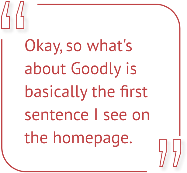
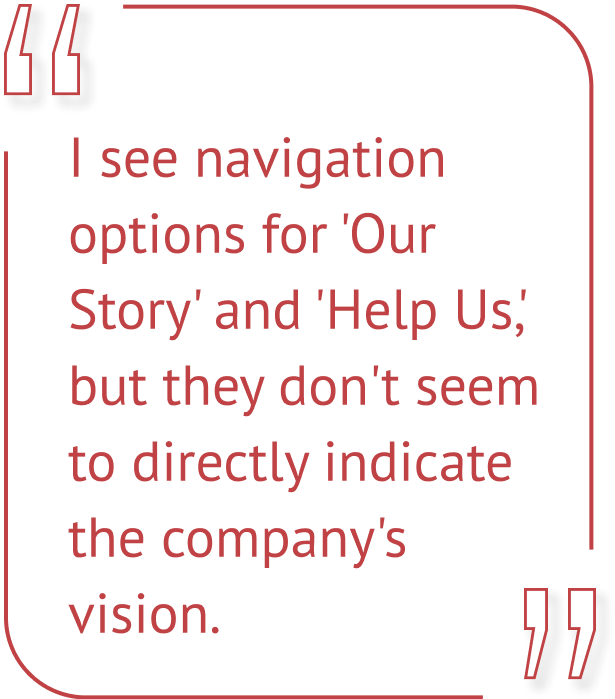
Locating Goodly's Vision and Values
Participants used the homepage to explore what Goodly offers, with some easily identifying basic information. 1 out of 5 participants found Goodly’s vision and values. Majority of participants had difficulty identifying core values.
Task 2
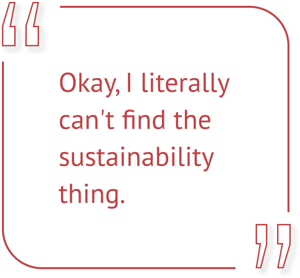
Finding Sustainability Information
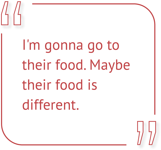
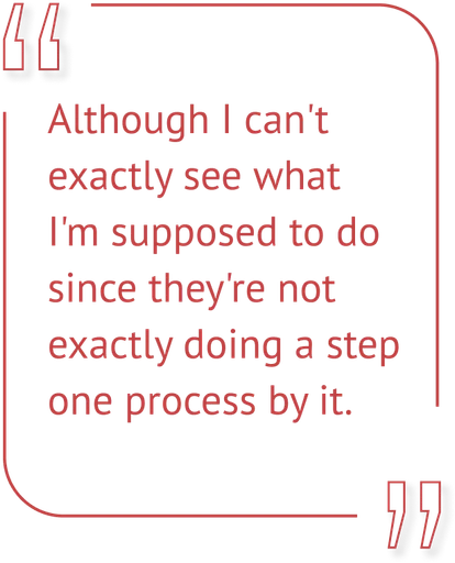
None of the participants were successful in locating sustainability practices. Participants navigated sections like “Our Story” and “Our Food” without finding relevant content.
Task 3
Finding Soup Information
Most participants easily navigated to the “Our Food” section and found soup-related details.Majority intuitively clicked on the "Our Food" section.
Task 4
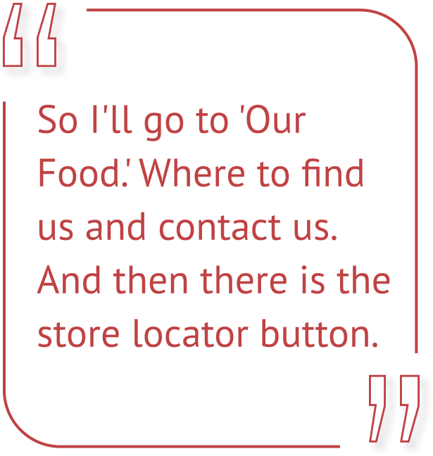
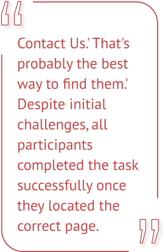
Using the Store Locator
Initial difficulties in locating the store locator button within the navigation bar.All participants completed the task after some effort.

interview
Asking the participant about their opinions regarding the website. Rather than on the fly, the participant can express their thoughts more comfortably.
We used post-questionnaires to assess four tasks and interview questions to explore broader usability insights, focusing on Visibility of System Status and Consistency and Standards. We also addressed Nielsen's usability aspects—learnability, memorability, and satisfaction—while excluding efficiency and error-related issues for a more targeted evaluation.

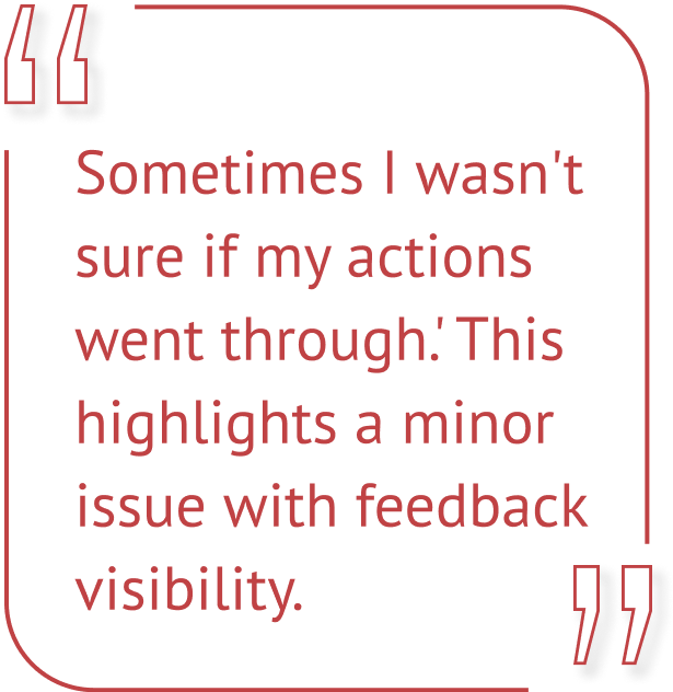
Visibility of System Status
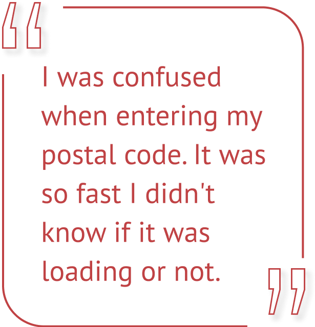
Clear feedback on user actions and progress
Participants expressed uncertainty about the completion of actions, such as when entering postal codes. Comments like, “I didn’t know if it was loading or not” indicate that fast processes may obscure feedback.
Consistency and Standards
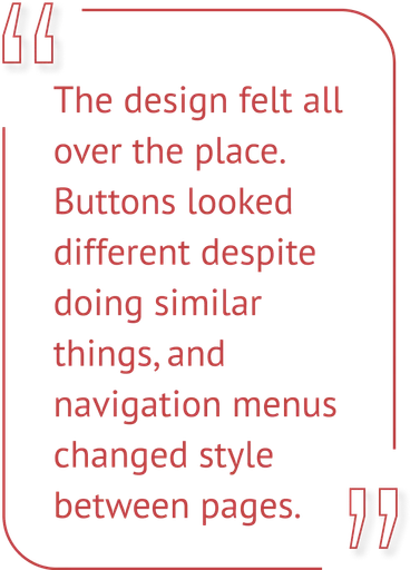
Uniform design elements and predictable behaviour
Design inconsistencies were a common concern, with participants mentioning mismatched buttons and navigation menus. Issues like the "WHERE TO BUY" button’s inconsistency caused confusion about whether it was clickable.

Learnability
Ease of learning and navigating the website
Participants had mixed experiences with recalling website features. Suggestions included maintaining consistent design and incorporating unique icons to make the site more memorable.
Satisfaction
User contentment with ease, efficiency, and appeal
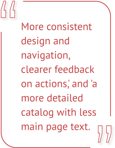
Navigation was confusing, with difficulty finding key info. Sustainability content was hard to locate, leading to dissatisfaction. Suggestions for improvement included more consistent design, clearer feedback, and a more detailed catalog with less text on the main page.

post-questionnaire
Asking the participant about their opinions regarding the website. Rather than on the fly, the participant can express their thoughts more comfortably.
Pre- and post-task questionnaires, administered via Google Forms, collected quantitative data on user experiences. Participants rated aspects like Goodly's company vision/values, ease of finding information, and overall satisfaction. The questionnaires were conducted before and after the website redesign to compare user perception changes.
Re-design
We conducted a heuristic evaluation of the Goodly website using Jakob Nielsen's ten usability principles, focusing on system visibility, user control, consistency, and error prevention. Each team member independently rated the interface on a scale from 1 (cosmetic issue) to 4 (critical issue). The evaluation, completed over two sessions by a team of four evaluators, prioritized identifying and addressing critical and major issues to enhance the user experience.
Homepage

Before
AFter
Homepage navigation in the initial study highlighted a need for clearer communication of Goodly’s core values and mission. After the redesign, participants found it easier to identify what Goodly offers, showing the redesign's success in clarifying the company's products and services. The streamlined presentation and promotion of latest news on the homepage improved clarity, reflected in higher post-redesign ratings.
Product page
Before
AFter
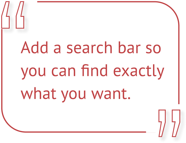
The redesign improved the product pages, making details on ingredients, recipes, and nutritional information more accessible. High satisfaction ratings indicated that navigation for finding recipes was more efficient. Since Goodly will only offer four retail soups seasonally, we decided against adding a search function. Instead, we focused on enhancing the navigation bar and footer to guide users effectively. This streamlined navigation, alongside clear product pages, ensures easy access to relevant content, improving the overall user experience.
Sustainability Information
Before
AFter
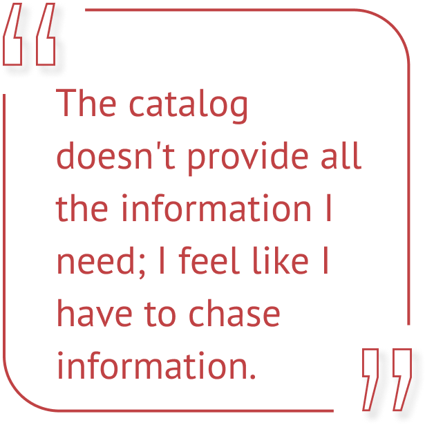
Participants initially struggled to find Goodly's sustainability information, highlighting a need for improved navigation and clearer content placement. The redesign introduced a dedicated sustainability section, improving visibility and organization, as reflected in higher ratings. However, while the redesign addressed the store locator’s visibility issue, ratings for this feature did not show significant improvement compared to other areas, indicating that further adjustments are needed for better accessibility.
Store Locator

Although the store locator feature received positive ratings, its page and button were not immediately visible to users. While participants were able to find the feature with some effort, its visibility needed improvement. Task 4 results showed users could navigate to it successfully, but the redesign aimed to enhance its accessibility. We simplified the navigation bar, making the store locator easier to find without extra steps. Some feedback on the feature's accuracy was noted, but we deferred these issues to Goodly for consideration, as they involve both front-end and back-end adjustments
Footer

The redesign tackles the usability issues from the initial evaluation, improving the user experience with a clearer navigation bar and footer. The search function was removed due to the website's limited content, focusing on intuitive navigation instead (Figure 11). Additionally, the "Contact Us" page was merged into the footer to streamline navigation and reduce unnecessary clicks.
2nd usability study
To evaluate the effectiveness of the redesign, we conducted another usability study. The same tasks were given to participants to perform on the redesigned website. This allowed us to compare user experiences before and after the redesign, assessing improvements and identifying any remaining issues. Post-task questionnaires were administered again to measure user satisfaction and the effectiveness of the redesign
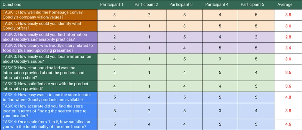
Participants rated various aspects of the Goodly website on a Likert Scale Rating from 1 to 5, with 5 being the highest rating. By comparing the ratings before and after the redesign, we can determine the impact of the changes implemented.


Task 1
For the task of identifying Goodly's company vision and values, ratings remained consistent before and after the redesign. However, ratings for identifying what Goodly offers improved, suggesting that the redesign clarified the company's products and services.
Task 2
Participants found sustainability practices easier to locate after the redesign, with significant improvements in visibility and organization. Additionally, the clarity of Goodly's story related to food surplus and upcycling saw slight improvements.
Task 3
Locating product information, including ingredients and recipes, saw substantial improvements in accessibility after the redesign. Participants also reported improved clarity and detail, leading to higher satisfaction.
Task 4
The store locator feature received the highest ease-of-use ratings after the redesign, achieving maximum satisfaction. Improvements were also noted in the accuracy of finding the nearest store and overall satisfaction with the store locator's functionality.
This project provided valuable hands-on experience in evaluating and improving user interfaces for a real-world client, Goodly. Working on the website's usability testing and redesign taught me how to identify critical usability issues and create design solutions that are both user-friendly and effective in communicating key information.
A key takeaway was the importance of addressing both aesthetic and functional aspects of design—ensuring the interface is not only visually appealing but also intuitive, consistent, and accessible. From conducting heuristic evaluations to performing usability tests and applying feedback to redesigns, this experience highlighted the essential role of user-centered design in enhancing website performance.